My Cover Art Process
I’ve settled on a predictable, identifiable cover style for my album releases. They are all based on the look and layout of my first cover, and I’ve been happy with each one. It should be obvious if you’ve seen one of my albums when you see another one. I think that level of consistency is important from a brand perspective.


The First Cover
My first album cover has informed the process over time. The theme of the album was the life-cycle of a failed romance. I wanted the cover to be mostly hopeful and bright, leading to a white background with a sunset over the ocean. The barely connecting hands signify the tenuous of relationships. The uncertain look on the face of the person in the lower left reflects doubt, while the upper right shows peace. Together they provide insight into the content of the music within. I applied this checklist to covers going forward.
Picking a Palette
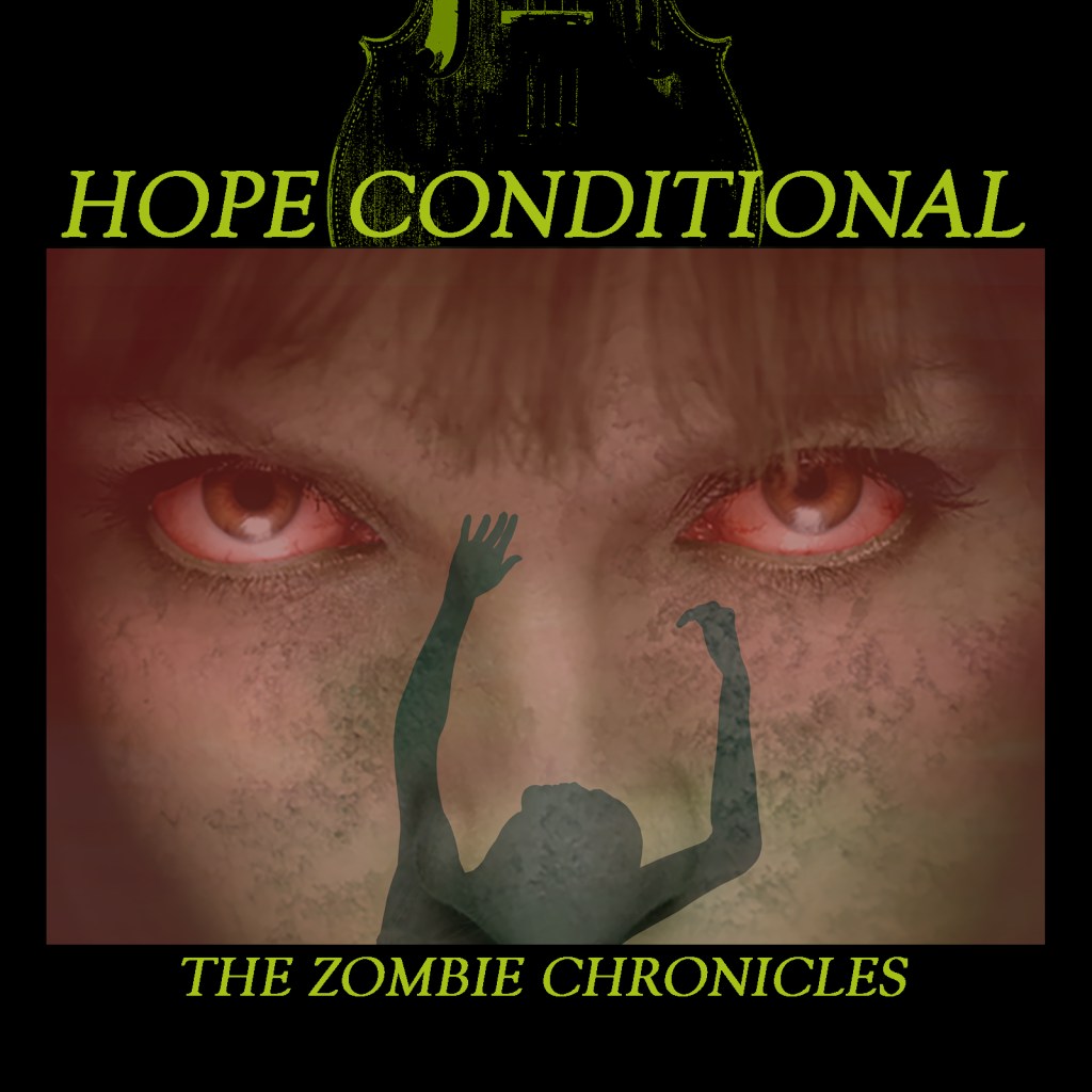
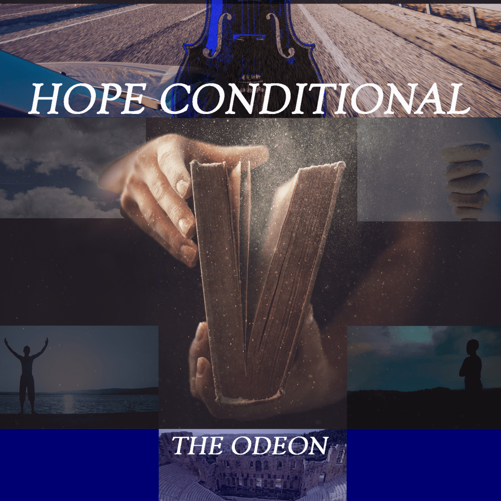
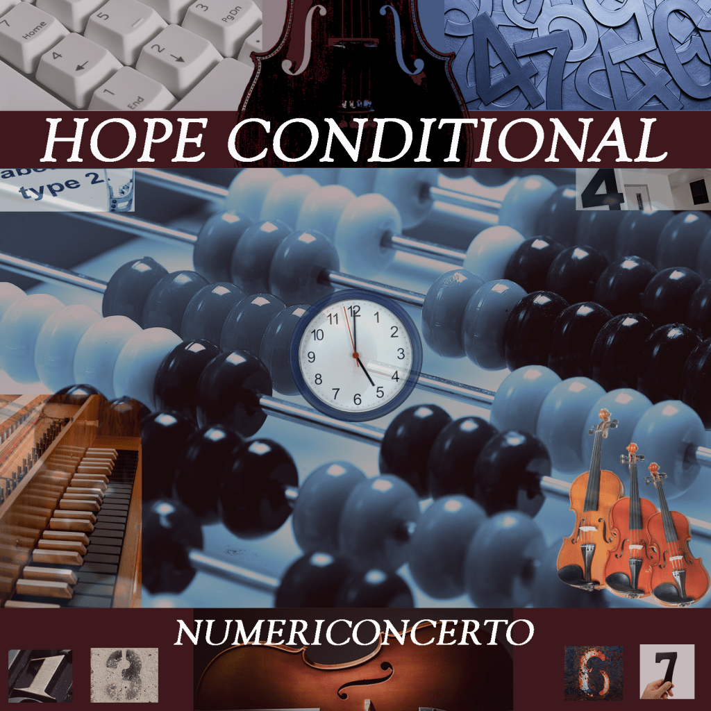
For each cover, I select a color palette that matches the overall theme of the album. For zombies, it’s black and dull green; for a phoenix fire is key; for an album about odes a blue was more appropriate. The reddish brown for Numericoncerto is intended to match the tone of most string instruments. The overall dull and unclear hues match the intent of sadness. I also try not to repeat too much, to give each palette its own unique flair.
Finding Photos That Match
I use Dreamstime and their library of royalty-free use photos for my covers. I will sign up for a month or two, download what I need, and then suspend my subscription until I need them again. They have an extensive, easily searchable library and I’ve always been able to find photos that work. Please read the licensing agreements before you use them in your work.
Each album suggests a specific imagery. For zombies, the dead look of the zombie face and the shadowy figures perfectly speak to the content. The flaming heart shape around the rising phoenix is equally effective. For my collection of odes, I returned to a more montage format, selecting images such as the slightly open book, the ancient amphitheater, and the open road to hint at the content. Numerology and orchestral instruments grace the cover of my concerto. That approach works well when selecting images.
Crafting and Exporting
Tunecore, as well as the streaming services, expect an image that is 1600 x 1600 pixels. I use Adobe Photoshop via their Creative Cloud subscription to construct each cover image, and then export it to a JPG for publication. It’s important to note that most streaming services restrict cover art, including any text that is not directly related to the artist name or title. As a specific example, in the Servings of Sadness cover above, you can read the content of the texts from the person who has been ghosted in the middle right. That text is not present on the cover I submitted to Tunecore.
Be welcome and true.

